As time progresses, offices are starting to reinvent themselves. From the way they are conceived, to how they operate and how they appear, workspaces today have come to be more than mere spaces of existence. In this context, the Pantone Colour of the Year plays an influential role. Each year, it shapes conversations across interiors- from materials and furniture to accents and finishes. Within office environments, however, its influence must be applied with care.
As long-term environments, workplaces are designed to support focus, collaboration, culture and wellbeing. When thoughtfully understood and applied, Pantone Colours become a valuable reference on the design moodboard, contributing balance and relevance in office interior design services without overpowering the overall colour strategy.
Cloud Dancer: Pantone Colour of the Year 2026
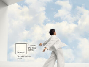
For 2026, Cloud Dancer has been selected as the Pantone Colour of the Year, presenting an intriguing exploration of how minimalism can intersect with brand identity and translate across diverse workplace personalities. Successful office interiors should focus on using Pantone Colours selectively, aligning where it appears with how it is expressed, ensuring the result feels functional and enduring.
Offices that age gracefully integrate contemporary influences gently, helping to support the spatial narrative rather than dominate it. Using Pantone Colours in transitional areas works as a good solution in office interior design services. Circulation routes, stair cores and lift lobbies, benefit as they are experiential rather than task-driven. These spaces offer a moment of pause, away from the hustle and intensity of boardrooms and meeting zones.
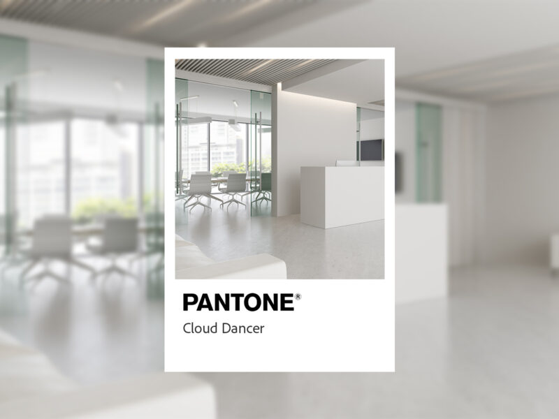
Reception spaces are areas where Pantone colours can work harmoniously with an office’s broader colour strategy. When thoughtfully aligned with office design colours, they can reinforce ideas of innovation, confidence or approachability. In 2026, Cloud Dancer Pantone can be used either as a calming backdrop within a more expressive setting or as a balancing element introduced into visually busy interiors to create clarity.
Balancing Pantone Colours in Workspaces
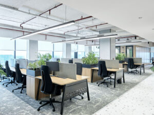
Elsewhere in the workplace, a more restrained approach becomes essential. Open-plan work zones, libraries and task-heavy environments rely on visual calm to support productivity, and overusing distinctive colour in these settings can prove distracting or date the space prematurely. While Cloud Dancer Pantone is among the more subtle Pantone colour selections in recent years, its strength lies in being distributed sparingly, allowing it to support rather than dominate office colour schemes in 2026.
High-cost and permanent elements such as flooring systems, fixed partitions, extensive joinery, and architectural finishes are not designed to change with annual colour trends. The most successful applications of the Pantone Colour of the Year remain those that can be adjusted, replaced or reinterpreted over time. Rugs, pin boards, wall graphics naturally soften colour, making it feel warmer and less trend-driven than paint. Natural materials such as wood, whether light oak, walnut or stained ash, counterbalance most Pantone Colours, making the space feel grounded.
Integrating sustainability using Pantone Colours
As important as it is to identify areas where a Pantone Colour is used, it is equally important how it is delivered. Just by incorporating an in-trend Pantone Colour of the Year rarely guarantees success; materiality determines how it is perceived, how it performs and how it ages. The Pantone Colour of the Year gains depth and credibility when office interior design services are able to embed it within materials that introduce texture, tactility and functional value. Textiles and soft architectural elements are among the most effective approaches.
More architectural applications can be achieved by incorporation of matte metals and mineral surfaces. Powder-coated steel, anodised aluminium, terrazzo or pigmented concrete allow the Pantone Colour to appear in a restrained, durable way. Satin and matte finishes reduce reflectivity and visual intensity, ensuring any Pantone Colour of the Year reads as part of the spatial language rather than a decorative overlay.
Read Also: Importance of Colours in Office Interior Design
Value of Pantone Colour trends in 2026
As office interior design services become more informed, in 2026, there is a growing opportunity to align the Cloud Dancer Pantone Colour with sustainability goals. Recycled PET (Polyethylene Terephthalate) panels, cork composites and other performance-driven materials allow Pantone Colour to support acoustics, wellbeing and environmental responsibility simultaneously. In these cases, Pantone Colours become part of a broader narrative.
By treating a Pantone Colour as a design input rather than a directive, it becomes a valuable tool – one that informs mood, culture and material exploration without overshadowing the entire scheme. In 2026, the most compelling workplaces will focus on how Pantone Colours can genuinely add value, and how thoughtful material choices can help it last well beyond the year itself.
Frequently Asked Questions
- How should the Pantone Colour of the Year be used in office interiors?
The Pantone Colour of the Year should be treated as a design input rather than a directive. In office environments, it works best when applied selectively, supporting mood, identity and spatial experience without dominating the overall office design colours.
- How well does the application of the Cloud Dancer Pantone colour in workspaces look in 2026?
Owing to its neutral and calming appeal, the Pantone Colour of the Year 2026- Cloud Dancer, works seamlessly with most office design palettes. Its cool grey gradient provides the perfect contrast for bright logos while offering a subtle yet effective way to enliven otherwise dull spaces.
- Which office areas are most suitable for incorporating the Pantone Colour of the Year?
It is most effective in collaboration and social zones – informal recreational areas, cafés, town halls and ideation spaces. Here, the Pantone Colour of the Year can support creativity and engagement when applied in a controlled and layered manner with office design colours, rather than as a dominant surface.
- What materials work best with the Pantone Colour of the Year in offices?
Soft materials such as upholstery, acoustic panels and textiles allow the colour to feel warmer and more adaptable. Timber introduces a sense of biophilic calm that helps express office design colours sit comfortably within professional environments. - How can offices use Pantone Colours without dating the space?
When balanced with neutral foundations and applied with restraint, any Pantone Colour of the Year can keep an office feeling current without tying it to a specific moment in time. Thoughtful zoning and material choice are key to ensuring it enhances functionality and longevity.


