
Colours are of utmost importance when it comes to the design of modern offices. They set the mood, stimulate creativity, and enhance productivity: They either greet the employees with bright colours and a promise of deep creativity or calm them down for focused work. Tailoring to the changing needs of the employees and the business, office-colour trends recently veered towards allowing for functional yet aesthetically pleasing interiors.
SKV India specializes in design of modern office interiors, which marry the aspects of colour psychology with functionality. Using their expertise in space planning and aesthetics, SKV India transforms work environments into places that increase employee wellness and productivity while reflecting a company’s brand identity.
Below, we explore some prominent colour trends that govern modern office interiors today.
Summary:
Discussing current trends for colours in office interiors, it describes the role colour plays in setting moods as well as in creativity and productivity. The blog charts the colours used these days-opulent neutrals with bold accent colours, gentle blues and greens, monochromatic schemes, Hall of Famer pastels, metallic glances, and black-and-white with their classic glory.
The blog also highlights how colour psychology affects office design by explaining how colours may generate certain feelings and behaviors in the workspace. Finally, it helps decide on a suitable colour scheme considering the organization’s purpose, brand image, and employee preferences, thereby assuring that the office environment is balanced and cohesive.
Earthy Neutrals for a Down-To-Earth Setting
Earthy and neutral tones such as beige, taupe, sand, or warm grays have truly become synonymous with the modern office interior design. These colours are specifically chosen because they emit the calming vibes, allow a person to stay grounded, shed focus in work matters, and eliminate stress from one’s mind.
Offices embracing earthy neutrals would usually highlight natural textures such as wood-paneling, stone accents, or even woven materials-the fine touches that further align this set-up with the principles of biophilic design. The pattern literally opens the doors to all things warm and comforting in the working atmosphere and also stands for any employee who will insist on working in a design environment of their comfort zone, responsive to nature.
The Power of Accent Colours to Recharge Spaces
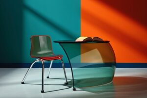
While neutrals provide comfort and accommodate the setting, bold accent colours such as mustard yellow, emerald green, and coral really throw in an attitude of energy into the workspace. Such colour treatments can be diverted to particular zones such as breakout areas, creative spaces, or collaboration hubs, fostering stimulation, discussion, and innovation. Assigning bold colours to furniture, wall art, or walls highlights the office ambiance, providing dynamism to the space whilst watching over the cerebral abilities of one’s senses.
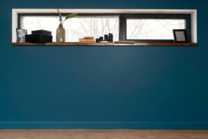
Calming Blues and Greens for Relaxation
Blues and greens remain classic colours to introduce calm and balance in a workplace. Soft tones of blue or green, such as sage green, sky blue, and teal, help alleviate stress in the workplace and heighten focus. These colours are received in spaces where relaxing is crucial, such as break rooms, wellness centers, or quiet workspaces. Their association with nature and serenity helps the employees to recharge and think positively throughout the day.
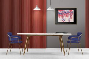
Monochromatic Colour Schemes for a Refined, Executive Appeal

Monochromatic colour schemes have found recent favor in the interior landscape for Corporate Offices of the industries that prefer that clean and professional ambiance. The palettes focus on shades and hues of any one colour family: grays, blues, beige, etc. Designers work with light, medium, and dark tones of a single colour to create a harmonious and dignified ambiance. Also, describe this to minimalistic furniture, along with clean lines. It fits well in an executive office, a board room, or a high-tech office.
Pastel Hues for a Gentler Aura
Pastels like blush pink, lavender, and mint green add a softer, more approachable vibe to modern office interiors. They find themselves favored in coworking spaces and the creative industries that promote such collaboration spirit and openness. Pastel colours provide a welcoming ambiance while sticking to a contemporary feel. Mixed with natural light and cushy furniture, these colours make the office feel airy and inviting, allowing good collaboration and creativity.
Explore: Office Interior Design Ideas
A Metallic Go-By for a Luxe Facade
Metals, including brass, copper, and gold, act as accent elements that imbue office interiors with a hint of wealth and sophistication. Luminaries, furnishing elements, or some decorative accessories could always have these finishes. Metallic accents go well with the neutrals and matte textures, producing a harmonious high-end look. This trend would be much well for spaces that get a fair share of clients: for example, a reception desk or conference room, where one needs to give a professional stature with a polished finish.
Black and White for Timeless Sophistication

The black-and-white look is an age-old charm that lately saw quite a resurgence among modern offices. The high-contrast duo makes for a classic timeless appeal. It is equally apt for a young startup and an established corporate headquarter. Without variations, monotonous would set in with repetitions. So designers go for textures and patterns that bring geometric shapes or natural materials into the black-and-white setup. This way is more fun to look at and presents some dimensionality while keeping to the straightforward and minimal backdrop.
Read more: Choose The Best Office Wall Colours
Introduction of Colour Psychology.
Colour plays a huge part in contemporary designing. It influences the feelings and behaviors of workers inside the work environment. By utilizing the effects and associations of colours on feelings-and psychological states-if a company chooses to achieve a particular goal, it could design interiors that best empower that goal in aiding high productivity.
- Red: Energizing and stirring, it is often employed in zones of Hothouse and Brainstorming, Sales, and Gym. But keep in mind, long exposure to red is an induction of anxiety; it is mostly meant to be used as an accent.
- Yellow: Associating with happiness, creativity, and warmth, will provide a friendly aura for cooperative areas, creative departments, and break-out zones; it inspires innovation and illicits feelings to fight fatigue or feeling of monotony.
- Blue: Blue stands as the colour of calm and focus. Light blues espouse calming influence conducive for break-out zones, hence, great for wellness centers while navy hues boost confidence and a sense of professionalism-apt for conference rooms or even executive offices.
- Orange: It channels the energy from red and the optimism from yellow. This colour brings kind of warmth and enthusiasm to a space. It is apt for social areas, cafeterias, or casual meeting areas where mingling and interactions take place.
- Purple: Purple is greatly associated with creativity and luxury and should be well suited for innovation hubs or design studios. While lighter shades like lavender hint toward calmness, darker shades like plum are full-on elegant.
- White: Symbolizing cleanliness and simplicity, the colour white instills the idea of openness and clarity in the design. It is mostly in minimalist decor and pairs well with nearly any accent colour to lift and define areas.
- Gray: An epitome of professionalism and neutrality, gray stands as one of the common colours for corporate offices. When set against warm or bold colours, gray accents help in making a space feel stable while allowing other colours to shine without distraction.
- Black: Black stands for elegance, power, and sophistication. A statement colour when used extensively, yet one can never lose if he applies it in moderation owing to an unwelcoming and overpowering atmosphere. The best way to realize it is either through fun accents or weighty contrasts.
- Pink: Pink is coming into common use in coworking spaces and creative offices for being a solution of warmth and playfulness. Pale or soft pinks are generally used in providing a laid-back atmosphere that is fairly welcoming.
When these colours are used in some areas of the office by design, it will allow the business to address various activities and moods while keeping the work atmosphere conducive for productivity and well-being.
Types of Colours to Choose for Work Placement
Choosing colours in an office generally means something to the organization according to the purpose, the identity of the brand, or the worker. In an example, a small company working with new technologies may select stark colours to stimulate boldness and innovation among others; law firms usually choose monochromatic colours to retain professionalism.
Engaging employees in the colour choice will help workers associate with that colour and feel a sense of ownership. When combining trends, one should do so wisely to avoid the clash between the hues and to complement the overall design of the office.
Learn about Crucial Role of Colours in Modern Office Interiors
FAQ’S
In what ways does colour influence productivity in the office?
Colours are important in determining employee productivity because they affect their mood, difficulty level and ease of work, as well as energy levels. For instance, the soothing colours blue and green assist in calming stress and help with focusing while bold accent colours like orange and yellow improves engagement. A balanced colour scheme creates a range of supporting environments for different types of work activities including collaboration and intensive concentration.
What other colour combinations can be used in an office designed for creativity?
Mustard yellow, coral green and emerald green are more energetic and inspiring making them ideal for a creative workspace because they enhance dynamic thinking. Moreover, coworking spaces and design studios benefit from pastels such as blush pink since they inspire collaboration coupled with mint which can create a warm welcome to spaces.
In what other ways SKV India can help businesses select the right colours for their offices?
SKV India modernizes working spaces by using interior design principles tailored for offices integrating functionality with colour psychology to aid in productivity demands resulting in decreased strain on employees’ wellbeing.. By knowing company details like brand identity alongside culture, along with requirements from employees called their needs SKV India sets brand within defined scoped promises yielding better value through decorated wellbeing-designed spaces.


